Showing posts with label Brief7Context. Show all posts

Saturday, 2 March 2013

Small Business branding

Patrick Debrosses by HelloMe, 2011

Patrick Desbrosses is a very personal photographer. Besides shooting intimate portraits, fashion and stories for magazines like Neon or Die Zeit he seemingly documents every moment of his life. To underline his ludic approach we created a modular and playful identity system based on the use of individual coloured frames. We used the basic colors red, blue and green that also compile the colormode of digital photography.


Mind Design: Marawa the Amazing
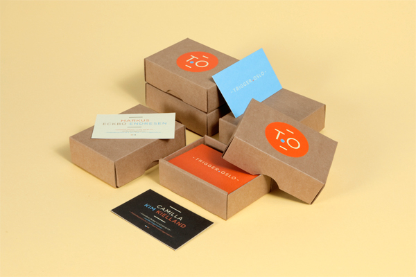
Identity for Marawa The Amazing, an international Hoola Hoop star and performer. The logo is based on the signage of old revue theaters which often use light bulbs. The stationery is printed in 3 colours and every business card is different. 
Tess
Identity for a a new London based model agency which evolved from Independent Talent. Tess represents well established names such as Naomi Campbell and Erin O'Connor in the UK. The identity uses several logo variations based on a modular system of art-deco inspired elements. The same elements are being used for frames which overlap images of the models on various printed applications as well as on the original website.


City Branding

Shrewsbury City Branding

Brand Guidelines

Visit Shrewsbury Brouchure

The City of Melbourne


Friday, 25 January 2013

Branding that can be applied to the Mosses Centre.

Inspiration for the Charity Full Identity Brand
Some inspiration for the branded outcomes: style, colour and effect.
Agency Self Promo 2012
I like the identity, but more the range of outcomes, a great array of products, and on top a very clever kit of self promotion, very well done.
A fictional group where typographers can work and design together. I'm not keen on the design, but the range is good. The typefaces are also pretty impressive.

Identity for a PR company who focuses on engaging communication, using welcoming colours. I love the style and colour palette.
A great inspiration for Cafe branding, although The Mosses Centre does not have the budget to deal with this.
A very clever brand and great use of colour. The branding is for the first exclusive club of Padel, where you can play with friends, partners and business colleagues. The space is completely represented in the logo, maybe the space/area of The Mosses Centre could be a key element of the branding.

Some more great design for Box-head*, the concept is relevant to Mosses Centre and it looks great and would be easily transferable.
The best inspiration for this branding I can find. A logo that can be changed according to use of different areas in  the City and in my case the different use of the building for the groups. I really like the bright vibrant colour and  the idea that image can be placed within the logo.  

A amazing Annual report that I love and it would be great to make something like this for Pete and The Mosses Centre. The concept is based on representing the employees of the company of the Annual Report, by photographs of their belongings.
A newer annual report of Anthon B Nilsen, is a clever representation of the building. This could be used as direct inspiration for the Mosses Centre, I like the idea of using the layout of the centre to inspire the layout of the annual report.


A annual report designed by a student, I like this because it is definitely a cheaper printing cost than the two HEYDAYS reports above.
A great design studio in Leeds with a very info-graphic driven Annual Report.

This is very plain, but I feel that it's too plain a bit boring for the Mosses Centre. Very smart and swish though.

Not a annual report, but a cheap print and a staple bind. Lovely layout and very easy to re-do new issues.

A pretty little zine.
 

A simple zine that uses colour print, I really enjoy the screen print and coloured ring bind.
 

Lovely number posters that could be used as a great way of promotion and celebration placed around the Mosses Centre or binding this into a book.

Great inspiration with a rustic feel of how The Mosses Centre could brand the Cafe.