
Inspiration for the Charity Full Identity Brand
Some inspiration for the branded outcomes: style, colour and effect.
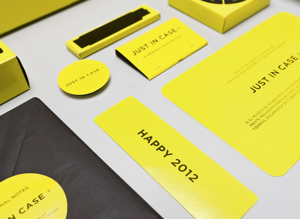
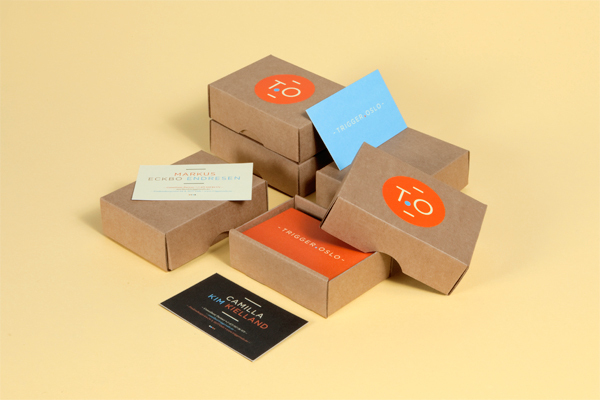
Agency Self Promo 2012
I like the identity, but more the range of outcomes, a great array of products, and on top a very clever kit of self promotion, very well done.


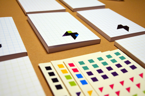
A fictional group where typographers can work and design together. I'm not keen on the design, but the range is good. The typefaces are also pretty impressive.


Identity for a PR company who focuses on engaging communication, using welcoming colours. I love the style and colour palette.


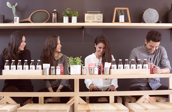
A great inspiration for Cafe branding, although The Mosses Centre does not have the budget to deal with this.


A very clever brand and great use of colour. The branding is for the first exclusive club of Padel, where you can play with friends, partners and business colleagues. The space is completely represented in the logo, maybe the space/area of The Mosses Centre could be a key element of the branding.


Some more great design for Box-head*, the concept is relevant to Mosses Centre and it looks great and would be easily transferable.

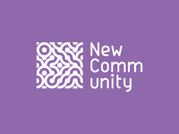


The best inspiration for this branding I can find. A logo that can be changed according to use of different areas in the City and in my case the different use of the building for the groups. I really like the bright vibrant colour and the idea that image can be placed within the logo.


A amazing Annual report that I love and it would be great to make something like this for Pete and The Mosses Centre. The concept is based on representing the employees of the company of the Annual Report, by photographs of their belongings.
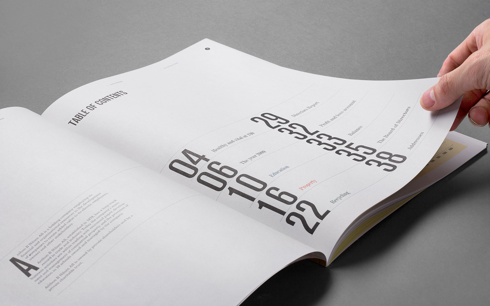


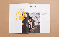
A newer annual report of Anthon B Nilsen, is a clever representation of the building. This could be used as direct inspiration for the Mosses Centre, I like the idea of using the layout of the centre to inspire the layout of the annual report.


A annual report designed by a student, I like this because it is definitely a cheaper printing cost than the two HEYDAYS reports above.


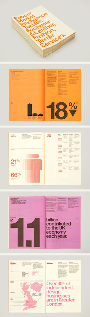
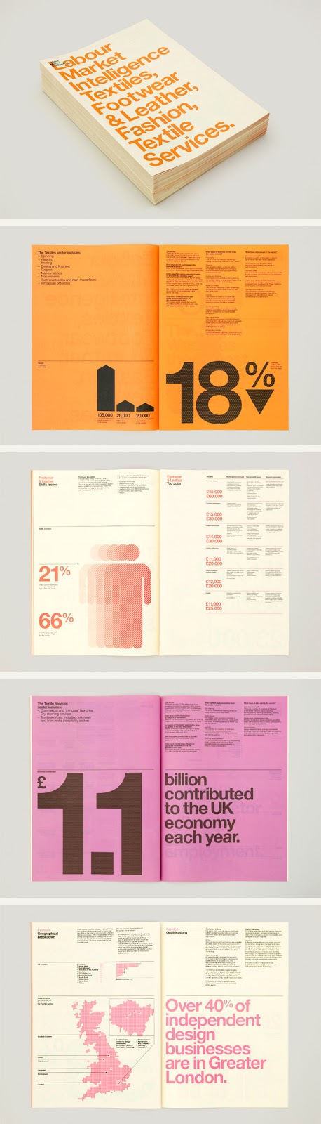
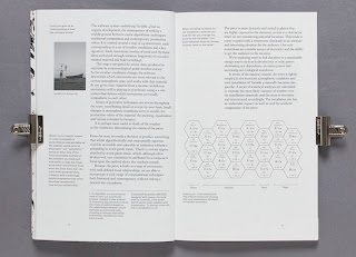
A great design studio in Leeds with a very info-graphic driven Annual Report.


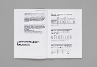
This is very plain, but I feel that it's too plain a bit boring for the Mosses Centre. Very smart and swish though.


Not a annual report, but a cheap print and a staple bind. Lovely layout and very easy to re-do new issues.


A pretty little zine.


A simple zine that uses colour print, I really enjoy the screen print and coloured ring bind.


Lovely number posters that could be used as a great way of promotion and celebration placed around the Mosses Centre or binding this into a book.


Great inspiration with a rustic feel of how The Mosses Centre could brand the Cafe.


No comments:
Post a Comment