
Happy Monday : Canada
Happy Monday is a selective group of passionate design geeks, UX specialists, developers, strategists, and writers who thrive to deliver the best-in-class interactive experience for users, brands and products. The site is under construction but their logo looks amazing, following them on twitter... hope they're work is great!


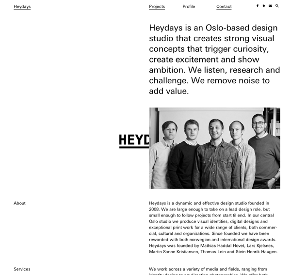
HEYDAYS: Oslo
Heydays, one of my favourite design studios, and one of my favourite website. I love the subtleties of there website, their logo disappears from the centre of the page when the mouse isn't being used. A very well though out website that takes a lot of consideration of layout and order of work.


Built By Buffalo : Brighton
A small web and developer company in Brighton, seem like friendly guys. As they say on their website they design simple but attractive websites (although I would have liked to see a thicker font used for the body copy on their website). I like their logo and the tone of voice they use. Their website is also re-sizable.


You probably think I'm obsessed and I am. When I first saw this website I didn't like the look of it, it looked too much like boring code... but it cleverly uses shapes to link to corresponding briefs art direction is a star, a poster is a square, etc. A very nice way of organising design. However I personally think it is hard to know if you like a brief until you click on the name, so to views the whole site you have to view all 41 links.


Spin: London
A very simple website, but one that showcases a lot of work in one space synchronizing with the left side project names. I would prefer to see all of the projects on one page.

Tsto: Helsinki, Finland
Tsto is one of my favourite deign studio and they have a very nice website.


Forma & Co: Barcelona
Forma & Co are one of my new favourite design studios and they have a really nice website. I like how it sort of looks like a tumblr page (homepage) and the layout of each project looks very similar to Heydays. It helps that they do great design too.


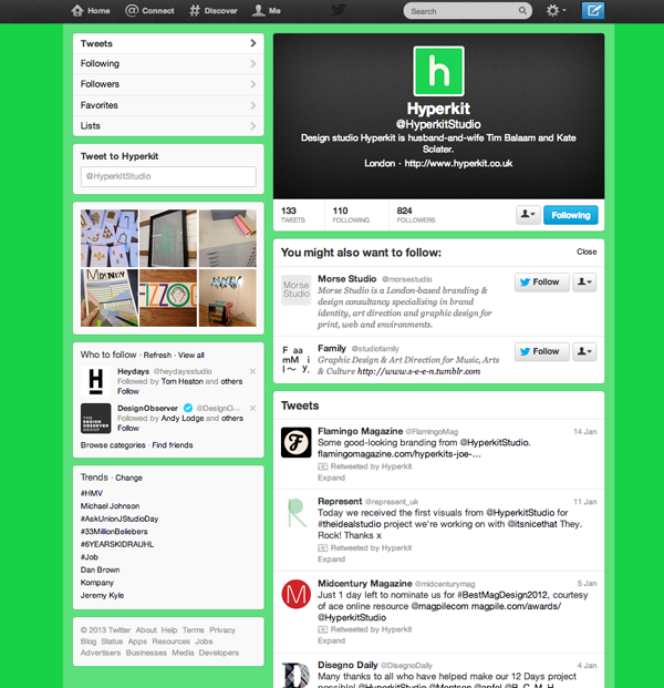
Hyperkit: London
Ever since finding the Ideal Candidate I have loved Hyperkit's work. There website is nice and simple, I love the layout of the homepage, very easy to navigate and show of their design skills well. The photographs in each briefs are the same size and in the same place, not fancy layout. They also have a newsletter page that it pretty impressive. But, the sight is not responsive. Images also take a while to load.


Paul Leichtfried: Berlin
A MA student that I have just recently found, with a great website. The website is responsive and has great use of opacity. It also have a scroll down for info, which I really like. I also really like the photograph layout and the white background. It definitely does the job!


We-Collide is the other name for Christopher Goodwin, a designer at Box-head* where I did my placement. I love his website and it was coded on Cargo.


Nice post. Thanks for sharing and providing relevant information. This is really useful. Web Design Services in Bangalore | Top Web Design Company in Bangalore | Website Designing in Bangalore
ReplyDeleteThanks for sharing the informative blog.
ReplyDeleteSEO Company in Bangalore |SEO Agency in Bangalore | Best SEO Company in Bangalore |Web Development Company in Bangalore |Digital Marketing Company in Bangalore |Web Development Company in Bangalore |Ecommerce Website Development Company in Bangalore |Ecommerce Website Development Company in Bangalore|Mobile App Development Company in Bangalore
putlockerfree.pictures We are amongst the Best Mobile App Development in Mumbai that offer IOS, Android Mobile Application Development services that look Great and act Smart.
ReplyDeleteEvery night. I mean, really, I just made dinner! Do I really have to do it again?
ReplyDeleteDownload TSF Shell 3D Launcher Prime