
Showing posts with label AdditionalBrief3. Show all posts
Showing posts with label AdditionalBrief3. Show all posts
Tuesday, 28 May 2013

Saturday, 25 May 2013
Submission Form & Evaluation & Design Context in PDF format
Submission Form
Design Context Publication
Evaluation Form
Tuesday, 26 February 2013

Thursday, 21 February 2013
21st February Crit
Feeling pretty positive
Not being big headed, but I think compared to a lot of people in the group I had a good amount of work to show and the most annoying thing about these sort of situations are that I have so much more background work... I have all of my stock ordered... I just need to carry on making.
I didn't really get any feedback that helped me, or told me something that I didn't know. So a pretty pointless crit... but at least I have done work.


Wednesday, 20 February 2013
Things to do today
Brief 1: Séaralit McCrea
Print out Typeface
Mock up mail outs
Create a mini portfolio fo Séarlait (vector of design outcomes)
Mock up Business card
Mock up Apron & Tools
Brief 2: Hannah Rampley
Pineapple patterns (Stationary)
letterhead, compliment slip, cv
Self promo (mail-out and fabric in a envelope)
Brief 3: Hunter Gatherers
Information & Format
Hunger Gatherers from around the world.
A survival guild for the UK
Survival Kit
Brief 4: Books Still? Drugs
Information & Format
Brain Storming Typefaces and layout
Brief 5: Fashion Yearbook
Meeting today
Brief 6: Content
Gathering info, Info-graphic
Brief 7: Mosses Centre
Brand and Identity
Different groups (rooms)
Café
Annual Report
Additional Brief 1: Fashion Show Pitch (Done)
Additional Brief 2: Yearbook Pitch (Done)
Additional Brief 3: ECLECTIC Album Cover
Sent of Image artwork, tbc about print specs
Additional Brief 4: Sam Jones
Printing a booklet / book or duplex poster of her Interdisciplinary FMP
Additional Brief 5: Fearless
Competition Brief by Taxi (Bristol Studio) to win a 4 week placement
Tuesday, 12 February 2013
12th February CritL: Andy Lodge
Feedback
I need to keep sending off to lots of stock companies to get a lot of free samples. So I have examples for clients and as reference. Order Fedrigoni. and Garnett based in Otley.
Geometry of Pasta interesting iconography.
Hannah Logo needs to be more consistent, I need to make the pineapple less sharp edged or make the type more sharp to make them fit better together. Push the material promotion.
Séarlait... get the type together. do examples for this week on how it can be applied.... make business cards. Get promotion together.
It's a case of gathering content for Brief 3&4. And creating a identity and style. In brief 3 I need to start categorising content and get the publication layout sorted.
Brief 4 I need to get content and know what I am going to make. Info-graphics. Find a lot of facts.
Brief 5 we are waiting to meet the fashion team.... I feel this will take a while.
Brief 6 I need to contact people.
Brief 7 (The Mosses Centre) - Andy said I should layout the brief and know what I should do and leave the major designing till later when I have the other briefs underway.
Additional Brief 3: Geordan ECLECTIC, basically just do designing as it comes along.
I need to keep sending off to lots of stock companies to get a lot of free samples. So I have examples for clients and as reference. Order Fedrigoni. and Garnett based in Otley.
Geometry of Pasta interesting iconography.
Hannah Logo needs to be more consistent, I need to make the pineapple less sharp edged or make the type more sharp to make them fit better together. Push the material promotion.
Séarlait... get the type together. do examples for this week on how it can be applied.... make business cards. Get promotion together.
It's a case of gathering content for Brief 3&4. And creating a identity and style. In brief 3 I need to start categorising content and get the publication layout sorted.
Brief 4 I need to get content and know what I am going to make. Info-graphics. Find a lot of facts.
Brief 5 we are waiting to meet the fashion team.... I feel this will take a while.
Brief 6 I need to contact people.
Brief 7 (The Mosses Centre) - Andy said I should layout the brief and know what I should do and leave the major designing till later when I have the other briefs underway.
Additional Brief 3: Geordan ECLECTIC, basically just do designing as it comes along.
Wednesday, 6 February 2013
ECLECTIC Ep
Changing the cover a little


Maybe because I have seen this too much, but I think I need to change the layout of the jagged images. I am going to pantone match the colours as well. I feel like Geordan should a have a more consistant colour scheme for the album. I feel it is very pastel at the moment.
I am completing the front a back cover design for tomorrow night (1400x1400 pixels minimum), I will sent it to Geordan to get feedback, then send the finalised version to Alex.
Alex email is below:


Alternative layout ideas.


Geordan emailed me back this morning...

So I emailed Geordan back with the amendments ...


Sunday, 3 February 2013
ECLECTIC EP
ECLECTIC needs the artwork

Geordan emailed me today. He says he needs the EP artwork (front and back cover) by the end of this work. The email below shows him forwarding in Alex Watson (I think he will pay for the EP production). Below he gave me the EP data that needs to be on the back / inside the album art.

ECLECTIC - INAUGURATION EP
NEW "INAUGURATION" EP RUNNING ORDER:
1. HYPNOSIS - 5:48
(VOCALS - G.REID-CAMPBELL)
WRITTEN, PRODUCED & MIXED BY G.REID-CAMPBELL pka ECLECTIC
2. 3 STAINS (ECLECTIC REFIT) - 6:36
(GUITAR - S.P.EVANS, VOCALS - S.P.EVANS)
PRODUCED & MiXED BY G.REID-CAMPBELL pka ECLECTIC
ORIGINAL WRITTEN BY THE HICS (S.P.EVANS, R.BARKER, J.WELSH, M.KNOX, D.TURAY, G.REID-CAMPBELL)
3. FAR AWAY (MISTY) - 5:41
(GUITAR - G.REID-CAMPBELL, VOCALS - G.REID-CAMPBELL)
WRITTEN, PRODUCED & MIXED BY G.REID-CAMPBELL pka ECLECTIC
4. WISHING - 6:40
(VOCALS - G.REID-CAMPBELL)
WRITTEN, PRODUCED & MIXED BY G.REID-CAMPBELL pka ECLECTIC
5. COLD AIR (ECLECTIC REFIT) - 6:10
PRODUCED & MIXED BY G.REID-CAMPBELL pka ECLECTIC
ORIGINAL WRITTEN BY THE HICS (S.P.EVANS, R.BARKER, J.WELSH, M.KNOX, D.TURAY, G.REID-CAMPBELL)
6. TRADING PLACES (EXTENDED MIX) - 8:07
(VOCALS - G.REID-CAMPBELL)
WRITTEN, PRODUCED & MIXED BY G.REID-CAMPBELL pka ECLECTIC
7. THREE FLOORS UP (INSTRUMENTAL) - 4:55
WRITTEN, PRODUCED & MIXED BY G.REID-CAMPBELL pka ECLECTIC
TOTAL RUNNING TIME: 41:14
64000 - 24BIT
I emailed Alex:

I emailed Alex:

Wednesday, 30 January 2013
Statement of Intent
Statement of Intent
I have defined all of my briefs and know exactly what I want to create for my FMP.
Tuesday, 15 January 2013
Context: Co-Op - Australian Freelancer
CO-OP is a Australian Freelancer named Paul Marcus Fuog opened in 2004. Some of his work is very abstract and art focused, whereas other is very typographically informed (this is the sort of work I prefer).
Identity created for a Fashion Company
Identity created for a Fashion Company
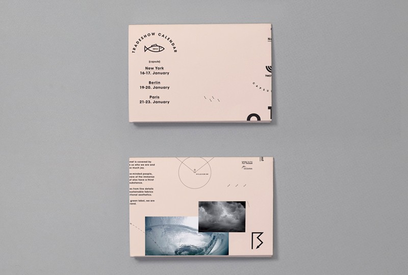

Created artwork for a Melbourne Band called Number Station with their release Hold On, Everything Will Change and Brocke and Never Go Home.
Beautiful colours and lovely print! Something that I would love ECLECTIC to have.


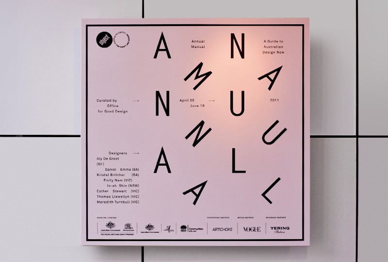
Exhibition Design and Print Collateral for Objects Gallery, Annual Manual: A Guide to Australian Design
Again beautiful design but in a Non Design trend.



Exhibition Design and Print Collateral for The Other Hemisphere, Millan 2011. Included 9 Australian design practices producing work in this theme.
Lovely branding for a arts event, with a nice concept.


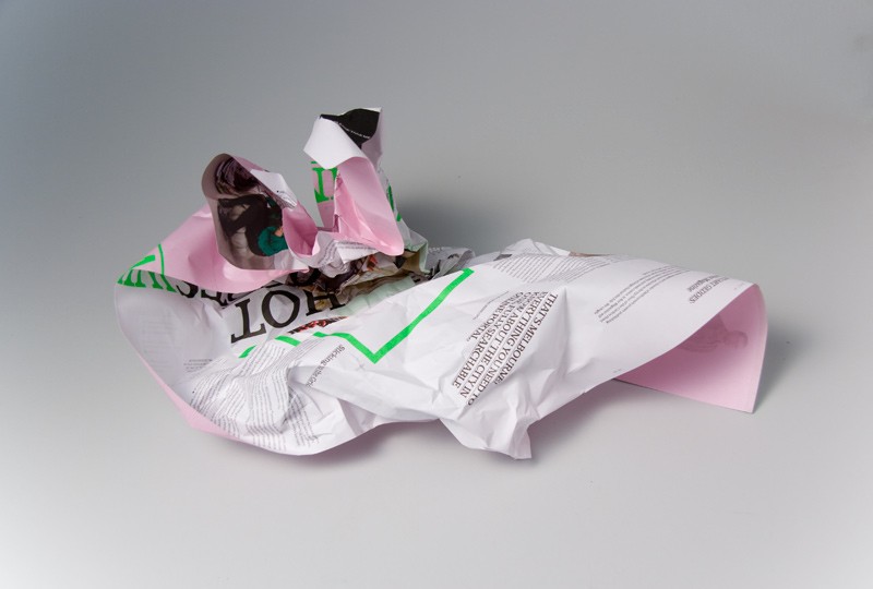
Editorial Poster with information on current culture of Melbourne City. (Winter Series 1/4) Cutting Budgets: saving money it eliminates folding and gluing & easy to transport.
The first design I found by Co-Op and I still find it amazing.



Invitation for a show for British Menswear Designer, Kim Jones
Beautiful textured background with some very simple print.

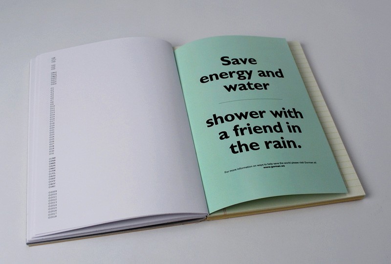
A book designed for fashion label Gorman. Educating customers on the merits of 'slow fashion' versus 'disposable pop fashion', reflecting year 10 into the past and ten years into the future (1999-2009)
Interesting formats.


Photographs exploring food use in Design
I just like these.


Subscribe to:
Posts (Atom)