Showing posts with label Brief1Context. Show all posts

Tuesday, 7 May 2013

Type Specimen Research

After speaking to Andy and Fred I need to extend my Séarlait McCrea brief. After looking at successful type specimen books I wanted to create one for this brief. My favourite is the Milieu Grotesque books, they have a narrative and are designed in a non-design way. Most are Riso Printed... if I was going to sell the typeface I would pay to have my specimen book printed.
Colophon Foundry

Sunday, 17 February 2013

Inspiration Séarlait picked out from:

'Introducing: Visual Identities for Small Businesses  
LavaFilm, created by Bureau, Bruneau, 2011
Lavafilm is a collaboration between two Norwegian Film-makers. A extensive typeface was created with at least 5 different variations of each individual letterform.
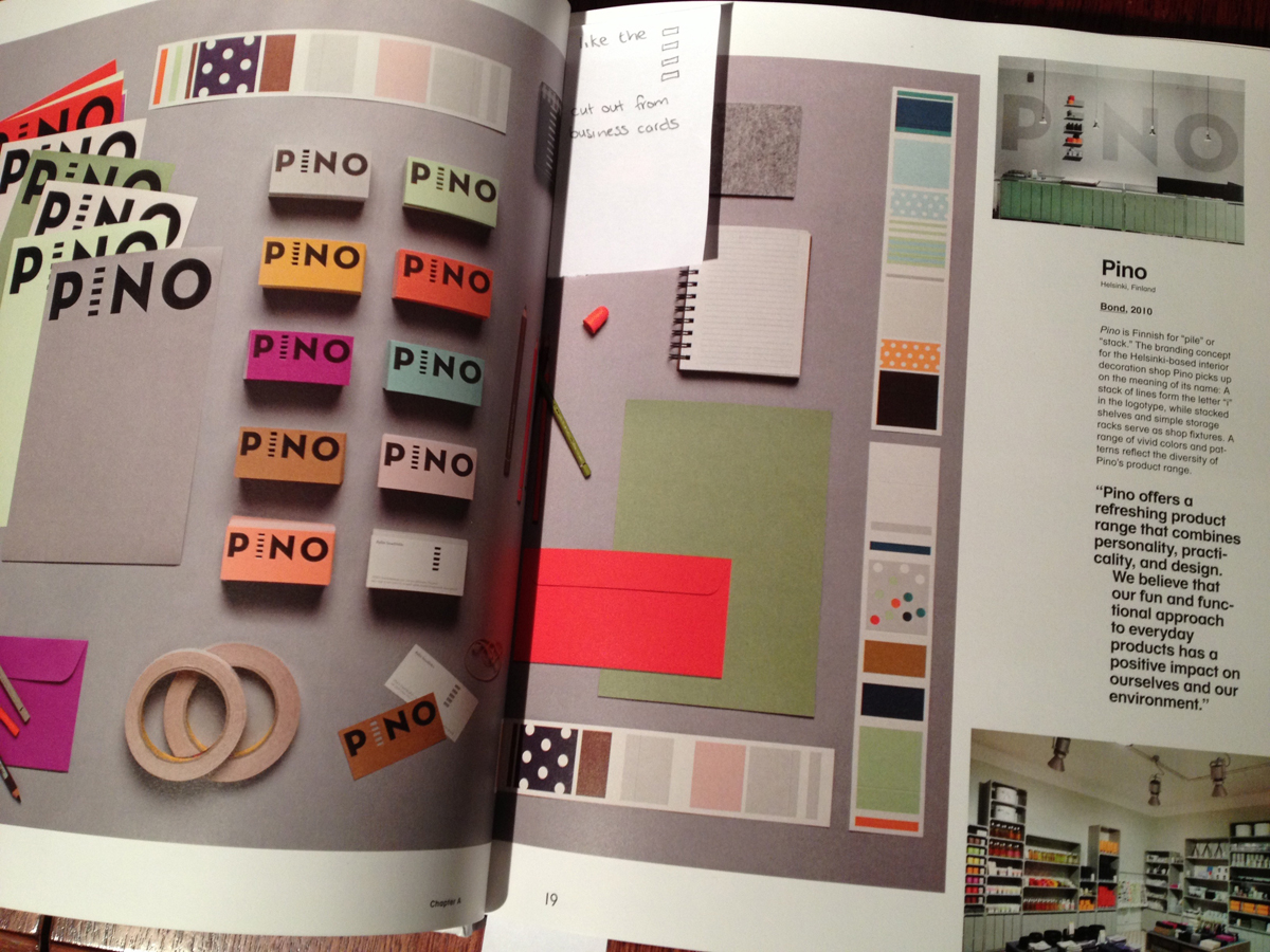
Pino, created by Bond, 2010
Pino is Finnish for 'pile' or 'stack'. It is a interior decorating shop, this idea of stacking is translated into the I of Pino. Séarlait liked how this was transfered across all the brand, including the store organisation.

Wednesday, 13 February 2013

Eskimo Creative

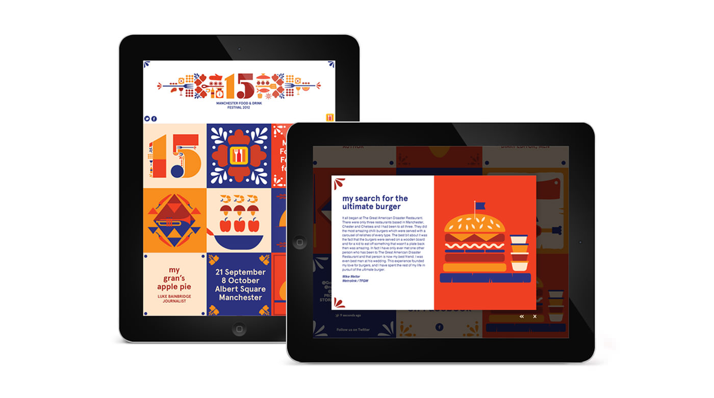
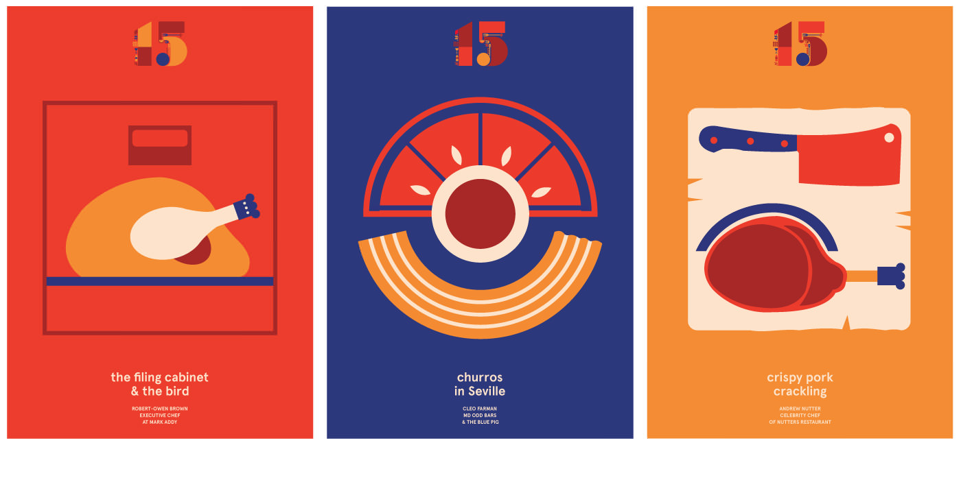
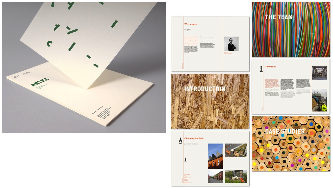
 A beautiful design agency in Manchester that creates a variety of pretty design work with create concepts.So here is a selection of their design work:
Manchester Food and Drink Festival
ARTEZ: New Construction Company
Graduate Prospects

 
Future Everything

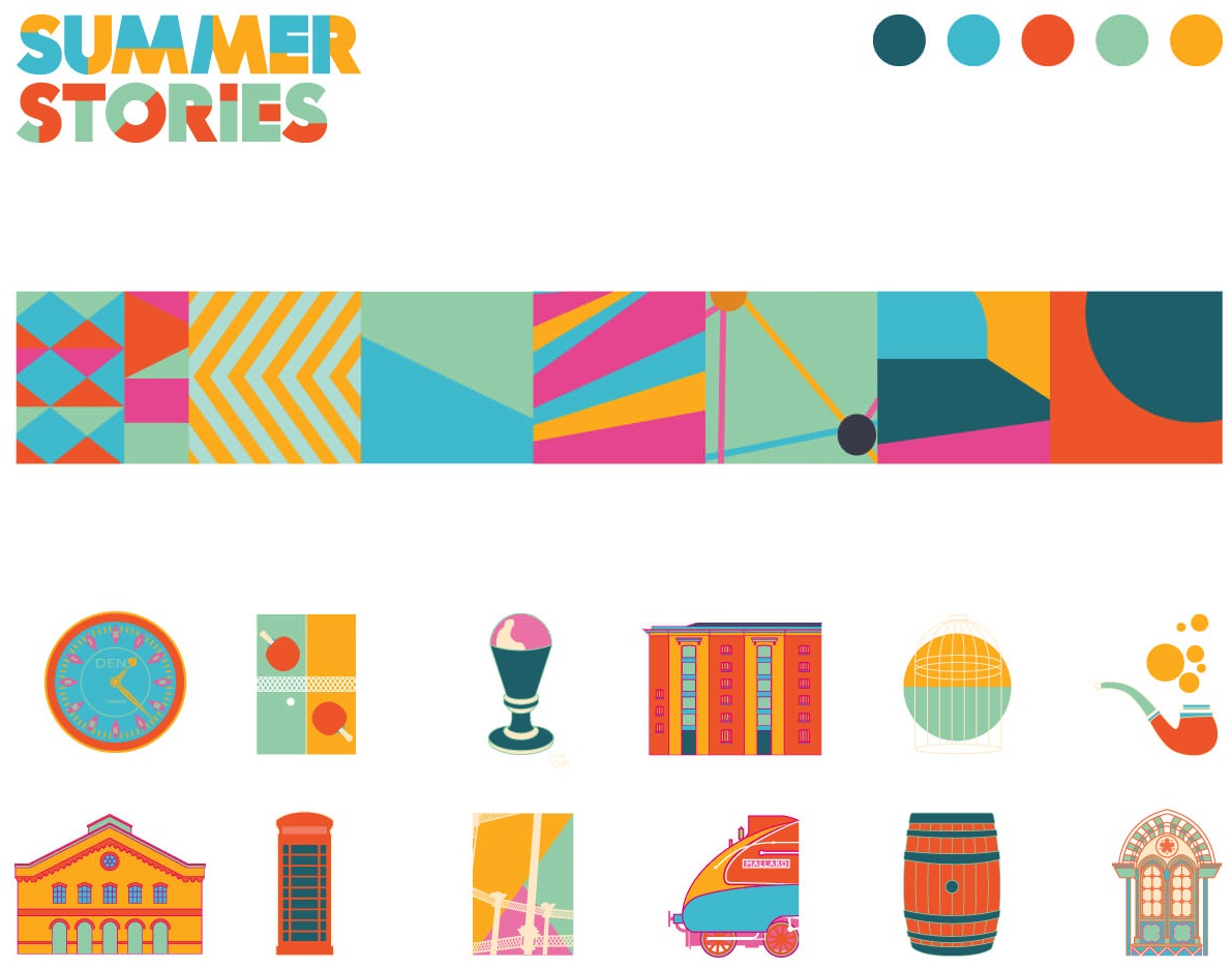
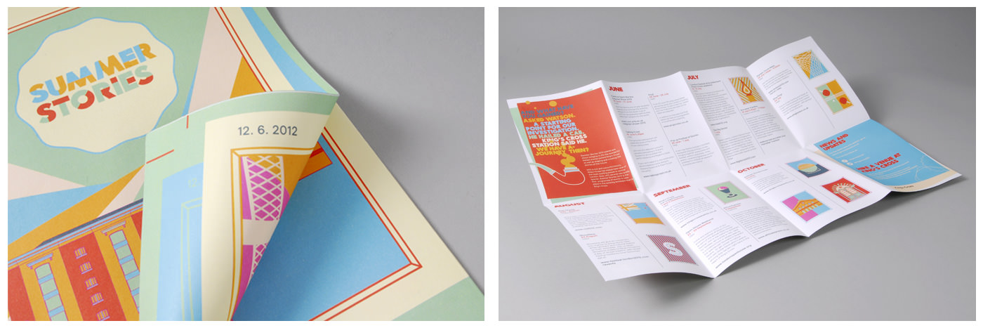
King's Cross Summer Stories


Tuesday, 12 February 2013

Passport

Passport is Rosalind and Jonathan who graduated from LCA last year. I really like they're design, especially their publication and type skills.
Rosalind's work: Fonecian
Infinity
Influence
Johnathan's work: A Drop In the Ocean
Passport : Studio Branding
R J Scott
I ordered 50 metal paper fastener, they are a nice way to temporally bind publications so more content can be added. They are used in Influence and R J Scott branding.

Wednesday, 30 January 2013

29th Séarlait Context

The concept:
Giving Séarlait a minimalistic and playful identity that is based on exploration through the context of symbols and interpretation of their meanings
Shared Pinterest Boards
We both have a shared pin board that we can pin on. Anything we see we can upload straight away and see what each other are looking at as influence.

Same Source
I found this flier on my way back to the studio after seeing Hannah. I bought it to the meeting with Séarlait and she said she saw it around uni, loved it and it is exactly the style she wants for her branding. I agreed, very stylish and minimalistic, we also loved the neon orange on grey stock.
I went to the new book shop and it is amazing, I ended up buying 3 books. I also found pretty screen printed notebooks, something I also wants to create for Séarlait's branding. She loved them and I will love to create something as eye catching for her branding.

The signs and symbols
A idea inspired by the Gypsy Hobo symbols I created whilst at Box-head* placement. 

Using the symbols to inspire a upper caps thin typeface to use for the whole identity.