Holien Mo is a Norwegian photographer who focuses on documenting stories and moment between people. The branding communicates his craftsmanship and beautiful imagery. They created a simple triangle word mark, used in patterns, stamping and embossing. This is used on many different paper stocks, creating a warm and sophisticated feel.
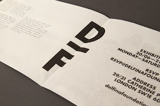
Spin: Delfina Foundation
There is no information on the website about this brief, but i love how simple it is. I could see some nice designed type sitting centre aligned, very plain but very effective.
Britton Britton: Mass productions
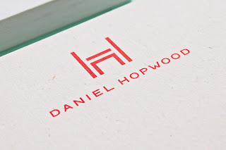
Two Times Elliot: Daniel Hopwood
I love this branding and I love this studio. A great logo and great colour palette, the only thing I would say is that the colours used on the print are not the same as on the web.
danielhopwood.com
Co-Op: Ben Glezer
Branding for a Photographer in Melbourne, Australia The concept is based on his approach informed by fine optical detail. Very simple branding but represents Ben well.
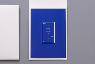
Another great branding from Co-Op for photographer Scottie Cameron. Very simple but using eye-catching colour to grab attention, I prefer this to Ben Glezer's. This branding has edge and sharpness.


No comments:
Post a Comment