I am thinking about doing the Branding for The Graduate Fashion Show 2013. Here is some research into fashion design, branding and art direction. I have realised I love the layout for Fashion Publications, very simple and with good colour theory.
http://canalmills.com/
Canal Mills is the venue of the Fashion Show. Below are a few Screen Shots. It would be nice to get a understanding of the venue so this could influence the design.
Research Below
Ro & Co - NY, USA
A neat sans serif typeface printed onto white stock using 2 spot colours. I really like the simplicity of the design. A nice idea os how the concept of the printed design is carried across the event itself, using the colours to wrap around twigs and large trees on the cat walk.
A neat sans serif typeface printed onto white stock using 2 spot colours. I really like the simplicity of the design. A nice idea os how the concept of the printed design is carried across the event itself, using the colours to wrap around twigs and large trees on the cat walk.
A really great use of colour. The Candela's SS12 campaign got inspiration from tropical foliage, bright textiles, and afro-beat music of the 70's. I really enjoy the 1st image of photographic montage, fashion design uses a lot of image manipulation. I'm a sucker for bright colours, so this defiantly ticks the boxes for me.
The invitation was tied with a bow to give invitees a sneak peek into the fashion show's set design involving thousands of yards of draped ribbon. The lookbook showcased Weiland's collection photographed at the show. Again I like how the concept is carried across the print, delivery and event. Really nice primarily black and white prints, everything very simple.
Loricks Fall 09 collection was inspired by the dark drama of the French New Wave, specifically François Truffauts The Bride Wore Black. We had the pleasure of art directing photographer Tom Hines to create the filmic qualities in the photos. We used narrative devices like suspense, the tension of a love triangle, and absurd Hitchcockian death scenes. Thankfully the weather complied, supplying us with appropriately stormy, sinister skies.
This is more a project on Art Direction but I loved the photography and storyline too much not to blog.
Lorick Spring 09
This photography is on a new level, the company created a installation during NY FAshion week that deconstructed the idea of keeping up appearances. The Design is very simple but has a vintage feel with grainy images and handwriting type.
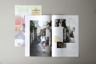
- Emphase Sarl - SwitzerlandThis is very Swiss Design. It works well as a fashion pull out. HELVETIA is a fashion Brand and this is a promotional print showing the Spring / Summer season of Clothes. I think I like this so much because of the beautiful photography, but mainly because I love designing posters and moveable publications.and another briefIm not sure I like this design, but the intentional use of a bad grid looks like a newspaper printed on expensive stock with high end photographs. This example entregues me as it breaks rules of legibility and readability.Leif Podhajsky - Australiafacebook 10,000 views on facebookOnly one of Podhajsky's design work on his website is directly for the fashion industry, but the design he produces in my eyes is very high end fashion. I love the textures, effects and manipulation he adds to all of his work. No doubt that all of his work is a beautiful image. Something I would like to incorporate within my practice.Sold scarfs with Leif's PatternsSingle ArtworkCreative direction, artwork and layout for Taylor Steele's new surf film 'THIS TIME TOMORROW'. Featuring Dave Rastovich and Craig Anderson.Not that relevant, but I like the brown textured stock, and very simple typography.I think I just liked the colours and the type. It is a very nice stationary set that reminded me of fashion due to the flushed image and contemporary type.My new favourite Fashion editorial Man. I just love the layout. Very Clean but definitely not boring, I cannot get enough. I would love to produce work that looked like this.I love the paper Marbling Effect this would work well within a concept and reminded me of fashion. I also love the typeface they used, atm I'm loving this style of design. They also use coloured pastel stocks... one of m favourite colour ranges.Beautiful branding and minimalistic. I am not a fan of circles, but the colours choices are amazing.


No comments:
Post a Comment